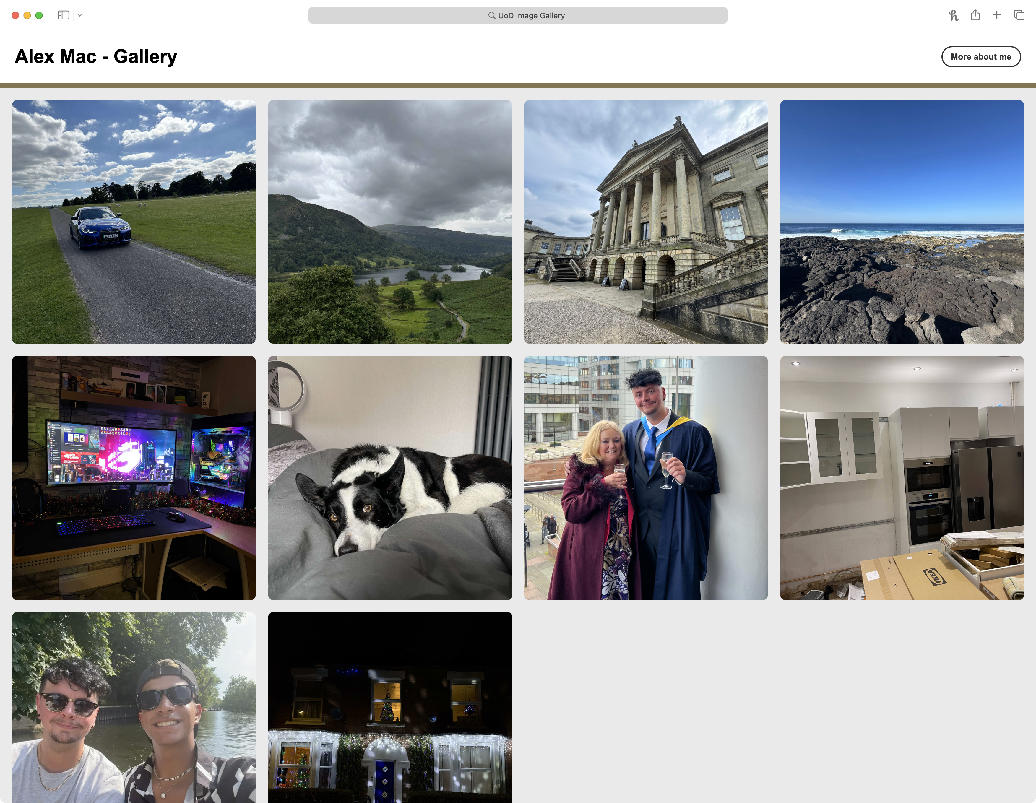
Projects
Responsive Image Gallery for University Portfolio Presentation
This was a bespoke project created to demonstrate my front-end web development and design skills, tailored for use in a university interview context.
Project Overview
Learn more about what the project involved below.
To create a responsive, interactive image gallery using HTML, CSS and JavaScript. The project needed to be functional on both mobile and desktop devices while reflecting elements of my personal style, interests, and technical ability.
Design and develop a custom image gallery with a clean, modern interface, built using only core web technologies. The layout and styling need to be inspired by the university’s existing content, with added enhancements to improve interactivity and usability. The gallery also should include personal visual content to give insight into who I am, making the project both technically sound and personally expressive.
The development began with analysing the university’s existing image galleries to ensure consistency in tone and structure. I drafted wireframes and tested layout behavior on different screen sizes before implementing dynamic modal functionality in JavaScript to display images interactively. I ensured semantic HTML and clean, modular CSS for easy maintenance and scalability.
Given the limited turnaround time (under 3 weeks), I chose simple, reliable web technologies that allowed for quick development and testing. By avoiding dependencies or frameworks, I reduced overhead and ensured maximum compatibility. Efficiency and responsiveness were key goals, with the project being completed well within the tight schedule.
Mobile-first responsiveness was central to the design. I modelled the UI loosely on familiar social media layouts (such as Instagram) to make navigation intuitive and visually engaging, especially for younger or tech-savvy users. Elements like modals and spacing were adjusted for touch interaction and accessibility.
Whilst I was not ultimately selected for the position, feedback from the university team was very positive. They noted that the design aligned well with their branding and would integrate well with their current design principles. They particularly appreciated the personal touches and thought the gallery was engaging and well-executed.
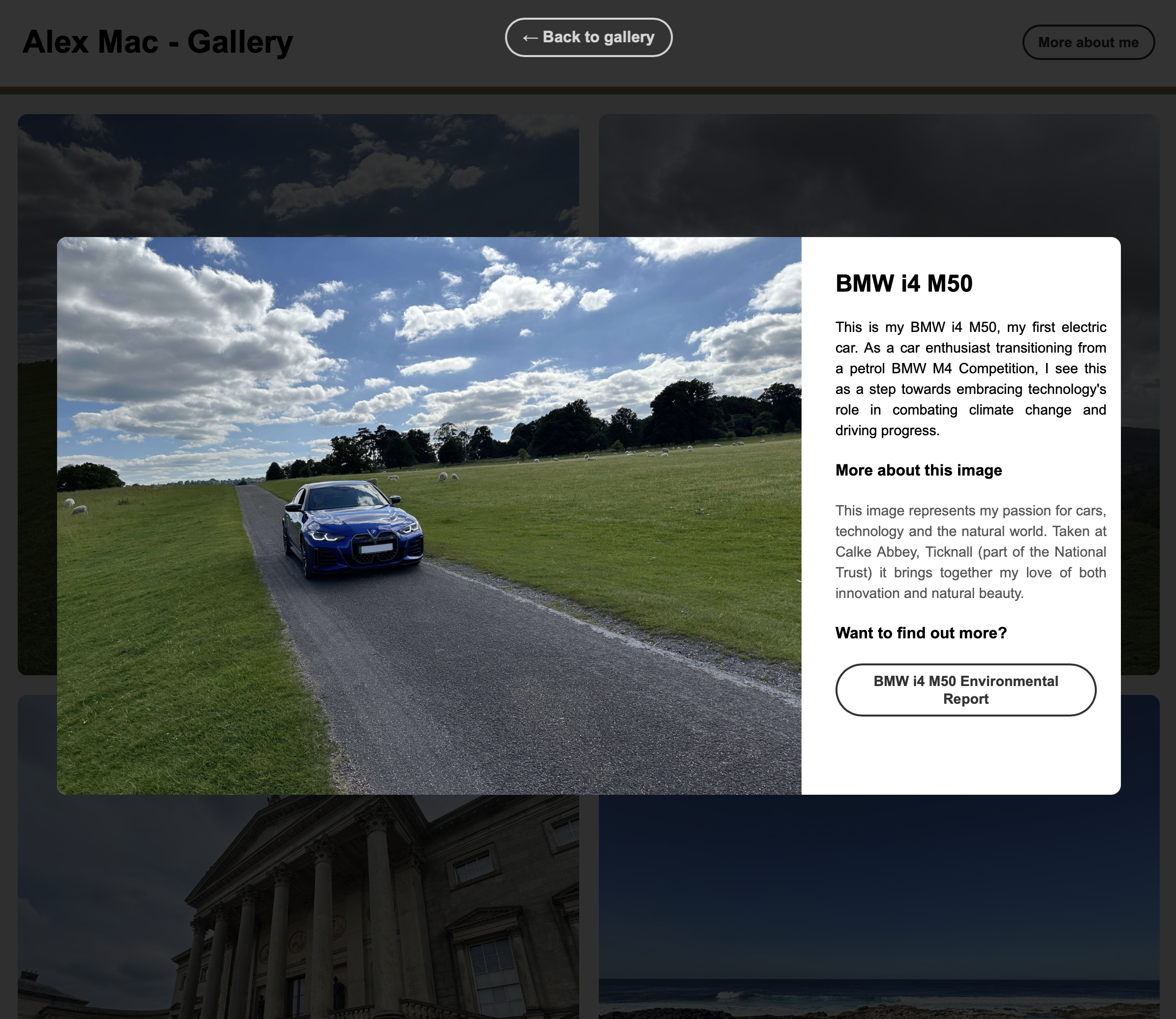
Modal for Desktop
Image Context & Story
Each modal introduces the image with a clear title and descriptive text, offering viewers insight into the subject matter and its personal relevance.
External Learning
A clearly styled call-to-action button invites users to learn more without distracting them from the main gallery purpose. This helps keep the experience informative but focused.
Focused Interaction & Visual Hierarchy
The modal dynamically darkens the rest of the screen to direct attention to the content. This ensures strong visual hierarchy, especially on larger displays.
Responsive & Intuitive Controls
The modal includes intuitive controls such as hover-reactive buttons, Esc key support and click-to-close functionality. These features ensure a smooth, accessible experience across devices.
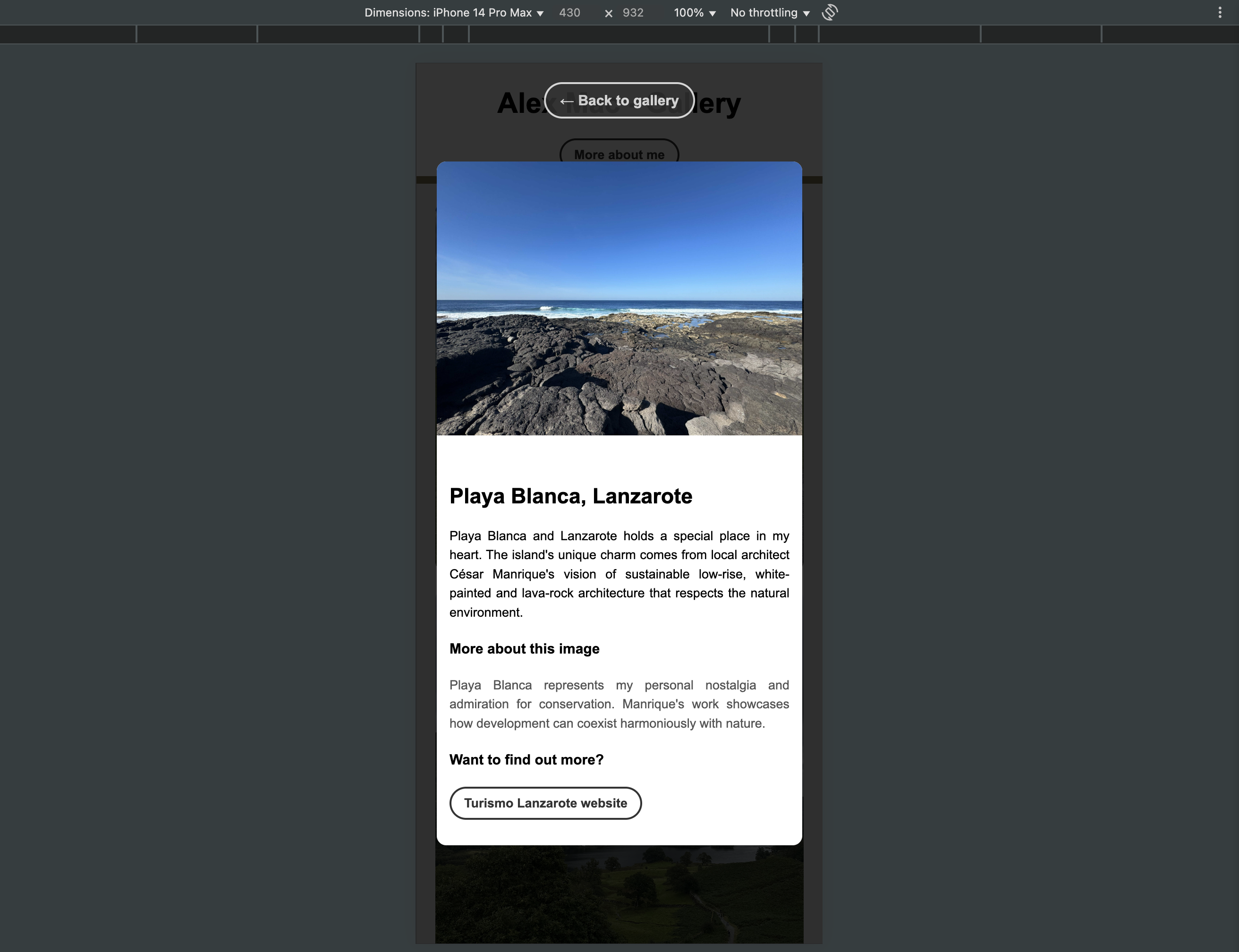
Modal for Mobile
Image-First Layout
On mobile, the image appears prominently at the top of the modal, allowing users to immediately engage with the visual content.
Expandable Descriptions
Each image is accompanied by a personal description and an optional external link for learning more, keeping content lightweight and offering depth when desired.
Mobile-Optimised Focus
The modal darkens the background to reduce distractions and spacing is adapted for thumb-friendly scrolling. Visual hierarchy is preserved to allow quick, focused interactions.
Touch & Gesture Controls
Mobile users can tap outside the modal to close it or use the button. All elements are optimized for touch interaction.